Playbooks · 5 min read
Which Parts of Instagram Automation Belong on a Phone
Most tools answer "does it work on mobile" with a responsive layout and stop there. That answers the wrong question. The useful question is which parts of running comment automation actually happen at a desk, because those are the parts a phone should not try to win.
We had to answer this properly while building the Android app, and the answer turned out to be sharper than expected.
The desk jobs
Three things are worse on a phone, and no amount of layout work changes that.
- Connecting an account. Meta's OAuth flow involves a permissions screen, an account picker and often a page-versus-profile decision. It is a form with consequences, and forms with consequences want a big screen.
- Writing the reply template. The template is the thing every automated reply is built from, and it carries variables, a link and a tone you will live with for months. People write better copy in a window they can see all of.
- Filling the knowledge library. Pasting your prices, shipping policy and refund terms is copy-paste work from other documents. That is a two-window job.
None of these is a daily task. You do each of them once, or once a quarter, and then you are done.
The phone jobs
What is left is what actually recurs, and almost all of it is small decisions made away from a desk.
Reading a held reply and deciding. A guard stops a draft, records the reason, and the template goes out instead. Somebody then has to read the draft and decide whether the refusal was right. That is a ten-second judgement on a paragraph of text — a phone task in the same way that approving an expense is a phone task.
Pausing something that is behaving badly. The gap between noticing a problem and fixing it is where damage happens. If noticing requires getting to a laptop, the gap is hours.
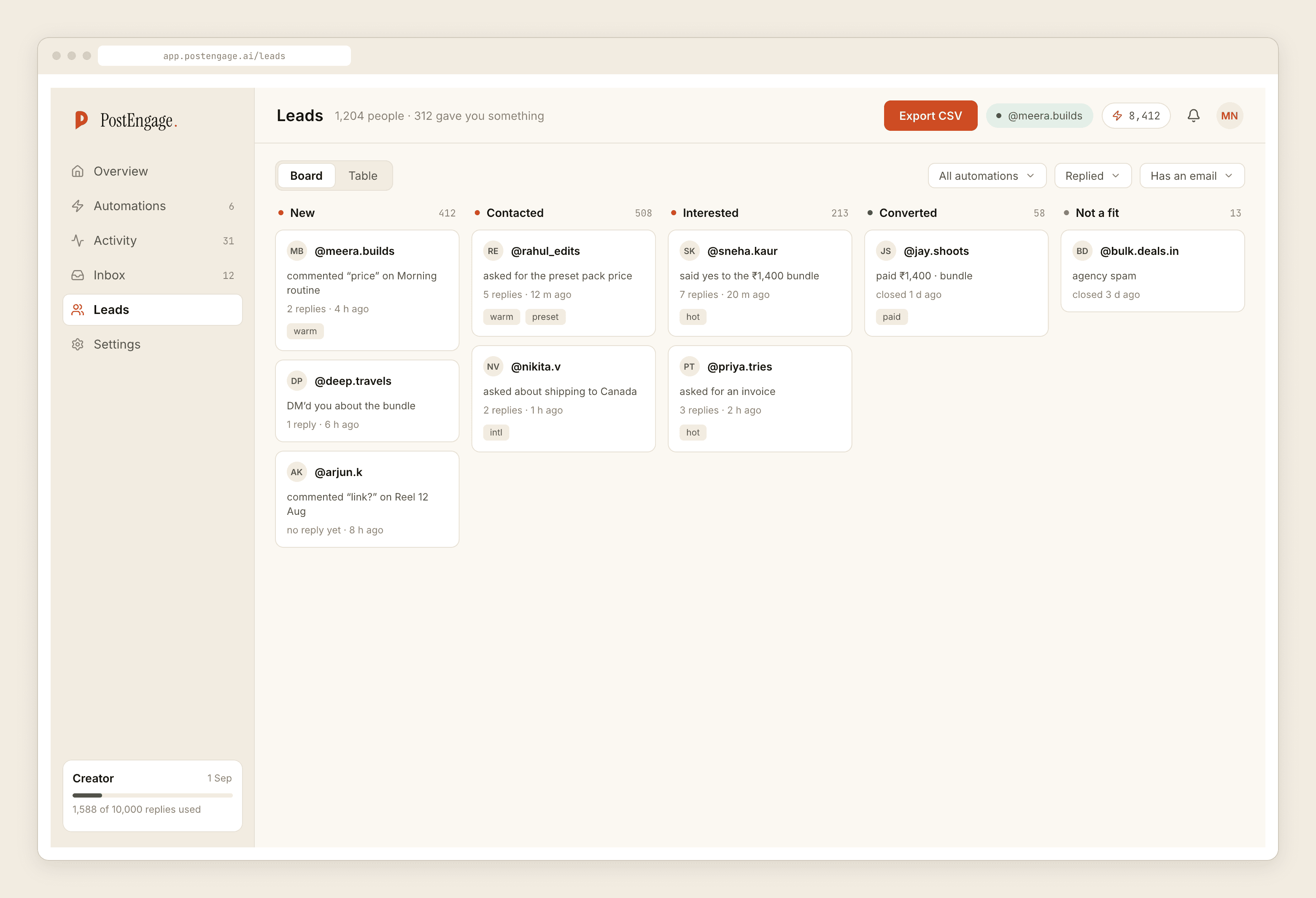
Working a lead while it is warm. Somebody commented, got a DM, replied to the DM. Moving them a stage and writing a note is a thing you do in the two minutes you have, not in a session you schedule.
Checking whether last night worked. Four numbers. This is a glance, and a glance is a phone.
Why the timing argument is stronger than it looks
There is a constraint under all of this that makes the phone half more valuable than a general productivity argument would suggest.
A DM can be answered for twenty-four hours after that person's last message. A comment gives you seven days. Both clocks run whether or not anyone is near a laptop, and the DM one runs out overnight.
So a held reply sitting undecided is not merely a task in a queue. It is a person who asked a question and received a template instead of an answer, and after a day the option to do better closes permanently. That is a different kind of backlog from an unread dashboard, and it is the reason we built the queue before anything else.
The weekly phone routine
If you want a rhythm rather than a feature list, this is what running this from a phone actually looks like once it is set up.
- Clear the held queue — usually a handful of items, ten seconds each. Approve, edit, or leave it for a proper answer later.
- Read three replies that did send, picked at random, as the person receiving them would. This catches register drift long before anyone complains about it.
- Check the leads that went quiet. Somebody who replied twice and then stopped is worth a sentence written by hand.
- Glance at the four numbers. You are looking for a step change, not a trend.
None of that is longer than a coffee queue, and it is the entire maintenance cost of a working setup. The failure mode it prevents is the common one: a setup that ran unwatched for a month and quietly got worse.
What we cut because of this
The phone app has no analytics screen and no scheduler. It does not because those were the two surfaces most obviously suited to being looked at rather than acted on, and a screen you only look at is a screenshot with extra steps.
It also does not do first-time setup end to end. You can create an automation on it, and that works — but connecting the Instagram account still sends you to a browser, because pretending otherwise would produce a worse first ten minutes than admitting it.
The part that changed our mind
The held-replies queue is the reason the app exists.
A held reply is a draft that did not send, sitting next to the reason a guard stopped it — the knowledge did not cover the question, the phrasing drifted, the same person already got an answer. Every one of those is a decision only the account owner can make, and the cost of leaving them undecided is that the person who asked got a template instead of an answer.
On a laptop, that queue is a page you open when you remember. On a phone it is a thing you clear in a lift. That difference is the entire product argument for a mobile app, and it is why we built the queue first and the dashboard last.
If you want to try it
The Android app is in closed testing, which needs twelve people staying opted in for fourteen days before Google will allow a public release. If you have an account, Settings → What's next has a one-click join. If you do not, the beta page takes an email.
On iPhone there is no build yet. The web app works on a phone browser and covers everything above except the install.
Questions people ask
Can I set up Instagram automation entirely from a phone?
You can create and edit automations from a phone, but connecting the Instagram account still goes through Meta OAuth flow, which involves a permissions screen and an account picker and is genuinely better on a laptop. Pretending otherwise produces a worse first ten minutes, so we send you to a browser for that one step and nothing else.
What actually needs doing daily?
Almost nothing, and that is the point. Clearing held replies, pausing anything misbehaving, moving a warm lead along and glancing at whether last night worked. All four are small decisions measured in seconds, which is exactly the shape of work a phone is good at.
Why does the app have no analytics screen?
Because a screen you only look at is a screenshot with extra steps. The surfaces we kept are the ones where you do something — approve, pause, tag, note. Four numbers on the overview cover the glance, and everything beyond that was reporting rather than deciding.
Is there an iPhone app?
Not yet, and the reason is that we have not built it rather than any policy obstacle. The web app works in a phone browser and covers everything described here apart from the install itself, which is what we use on iOS ourselves.
What is a held reply?
A draft that a guard stopped before sending, stored next to the reason it was stopped — the knowledge did not cover the question, the phrasing drifted from your voice, that person already got an answer. Somebody has to read it and decide whether the refusal was right, and that decision is the reason the phone app exists.